Nighttime Lights
When looking only at images from above or maps, it is quite easy to forget that night exists at all. When we are first taught how to read maps, it usually includes imagining what the area looks like if we viewed it from a very high place above. It is quite natural for us to picture that during daytime. Additionally, colors used in the real maps are associated with the daytime colors of the map items, fields are yellow, forests green and lakes blue. Almost all of real the images we see taken from a high vantage point - satellite images, pictures from drones and airplanes – are also usually from daytime.
There’s a good explanation for this – we humans do not get much information from an image taken without a source of visible light. It’s just black for us. Daytime images are rich with detail and vibrant with color as the electromagnetic radiation emitted by the sun is reflected off different things and afterwards reach the camera lens. Even as we discussed in earlier issue different wavelengths and how they highlight different things in the environment compared to visible light, we do not get much information from those at night. Remember, these measurements are passive – they are based on the reflections of radiation sent by a radiation source (mainly our sun).
A scene on the planet, during night, does not receive this visible radiation from the sun, so there’s not much visible light energy available to get into the sensor in a satellite. We do not see the surface features or details well. But if our sensors measure longer wavelengths, there is the heat related energy from the planet itself. The wavelengths associated with the electromagnetic radiation with the sun and the earth are well separated in the electromagnetic spectrum. The wavelengths associated with the planet’s temperature is quite far in the spectrum from the areas the band of the instrument we are discussing today can see. We’ll get back to that on a future issue. Figure 1 illustrates these basic principles.
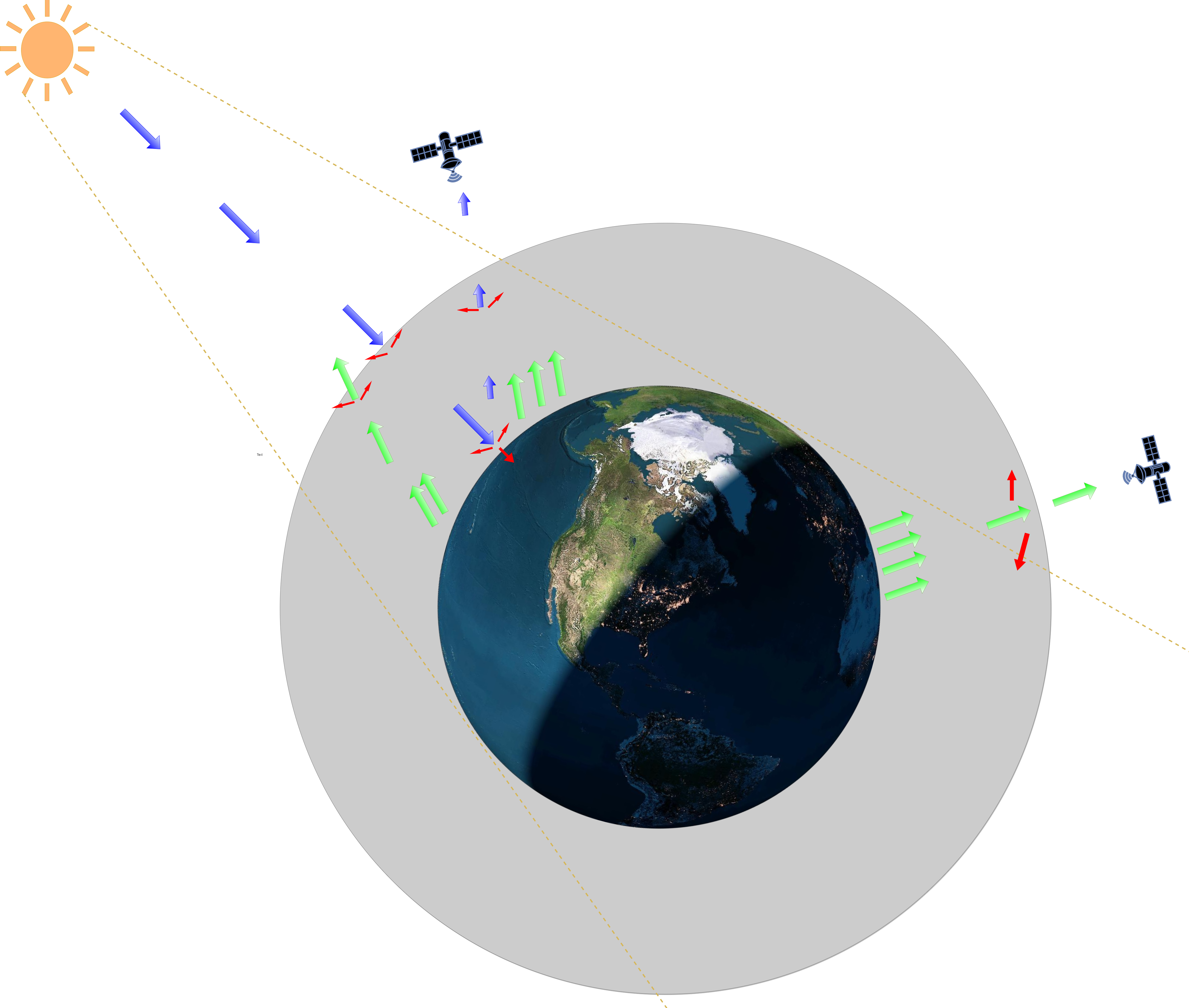
Figure 1. Differences in daytime and nighttime observations illustrated. Click to image to enlarge.
But we had nighttime image as this months featured image? Additionally, it was not pitch black, clearly there is something visible in the image. If we compare a map of cities with this image, we see the information in the image to be mostly from the same areas where cities are. We can then assume that these visible areas are places where also exists concentrated human activity. That explains why they are visible during the night as well, as these kind of areas have lot of lighting as we need that to function properly. In other words, they are areas emitting a lot radiation in the suitable spectral range for the sensor in satellite to record. We can also use that line of thought other way around – areas that are not visible are not having these sources and most likely then do not have dense human activities.
We are talking about and showing observations from satellite called Suomi-NPP. It has onboard an instrument called the Visible Infrared Imaging Radiometer Suite (VIIRS), which measures radiation metrics in 22 different areas of the electromagnetic spectrum. These 22 bands are mostly concentrated on visible area of light and the infrared (heat region). Images we show here and in Megamagazine were based on observations in only one of the bands, which collects reflected electromagnetic radiation between 500 nm and 900 nm. Roughly starting from the beginning of blueish green in the visible spectrum and ending in the near infrared. In an earlier Kvarken Space Conversation we took a closer look on what are bands and how the electromagnetic spectrum is constructed, you can refresh your memory here. Most of these sources of radiation it measures are so small, that during the day they are hidden below the larger amounts of reflected radiation from the Sun on the same wavelengths. Night is opportunity here, some of the things that are difficult or impossible to investigate during the day, can be easily detected during the night. For example, Finland during day and night highlights completely different things as the following figure 2 shows.
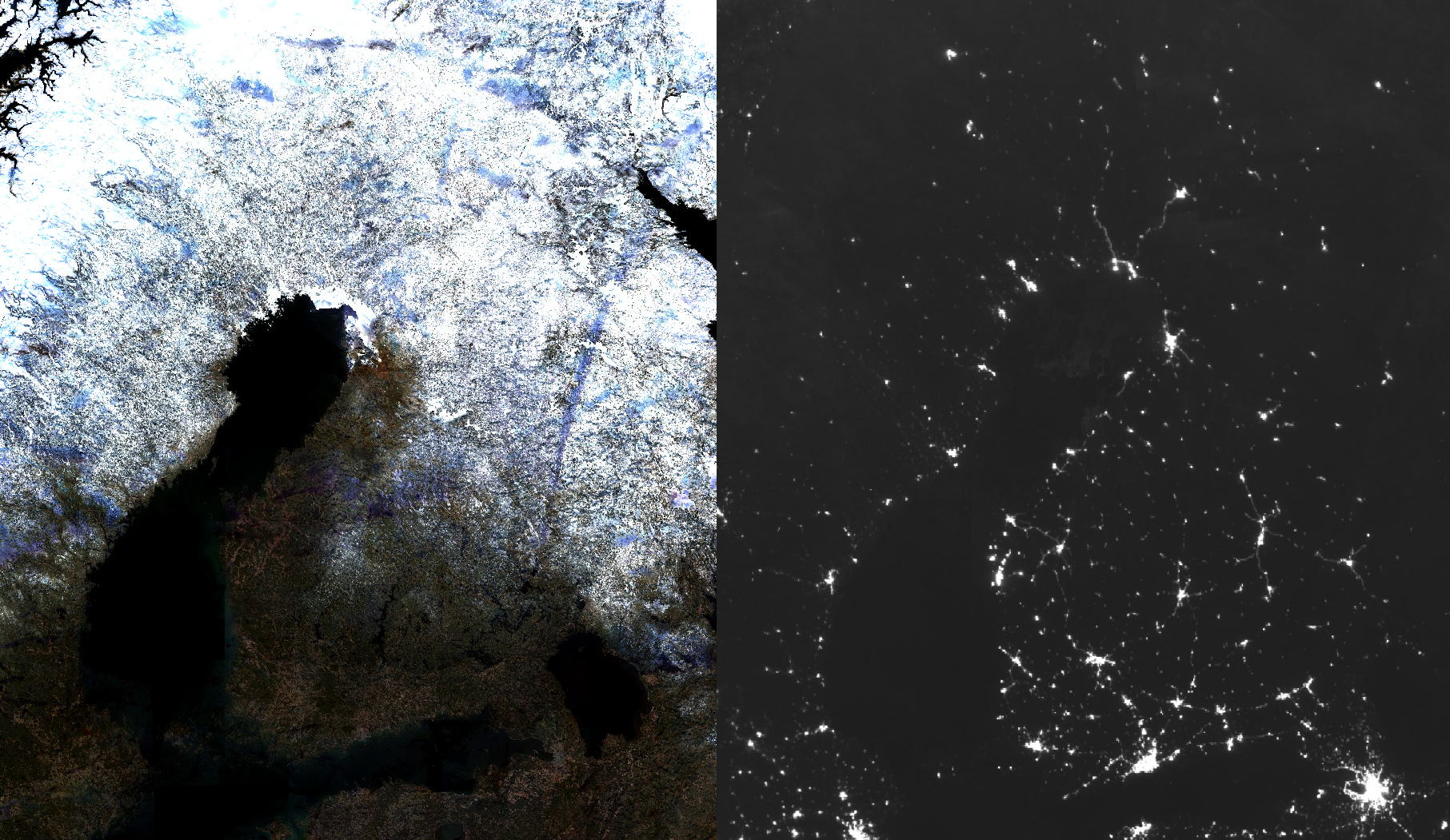
Figure 2. Left: Composite of Finland from Sentinel-2 images created in Google Earth Engine, from winter/spring 2020. Right: Nighttime composite of monthly averages from the same period, from the VIIRS night measurements. Click to image to enlarge.
If you recall our last Kvarken Space Conversation, there we discussed in detail what difference images are and how they are created. We can observe changes in the things visible during the night with the same technique and easily get some new information. We simply visualize the difference of the illumination amounts and it should point as to places where some change has happened. Then it is another challenge to determine what exactly has changed and what has caused it. There can be quite a lot of different reasons for the change we see. Some are easy to understand, some not so. In the following figures 4-11 you see some of the interesting things we have found while exploring the data with the tool we created.
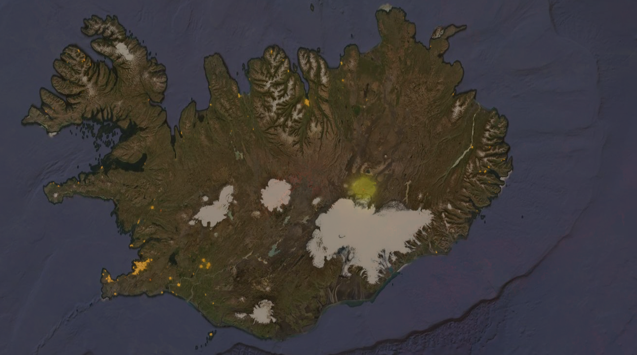
Figure 3. Eruption of Bárðarbunga visible in the right-center of the image, in Iceland. Yellow areas mark strong nightlight emittance in a composite from Fall 2014. Image contains additional overlay of reddish nightlight composite from winter 2015. Where nightlight emittance exists from both of these dates, the result is the orange color visible in the cities. Where only from 2014, color is yellow. Reddish for emittance only from 2015. The volcanic eruption is largely visible as a yellow circle, which has in it’s center just barely visible tiny speck of red. That’s how much lower the light emittance was in the later image. Click to image to enlarge.

Figure 4. Change visible in the positions of presumed oil rigs between 2014 and 2020, off the Nigerian coast. Click to image to enlarge.

Figure 5. Changes visible in Seinäjoki nightlights between 2014 and 2020. In general on the rightmost side you can see general intensity changes (cyan) and with purple color the places where our algorithm detects spatial change. Spatial change right of the center is suspected to be the new highway and even the new Ideapark complex is visible as the purple speck at the top left parts of cyan. Purple in the lower middle parts of the cyan is possibly the new hospital area. Click to image to enlarge.
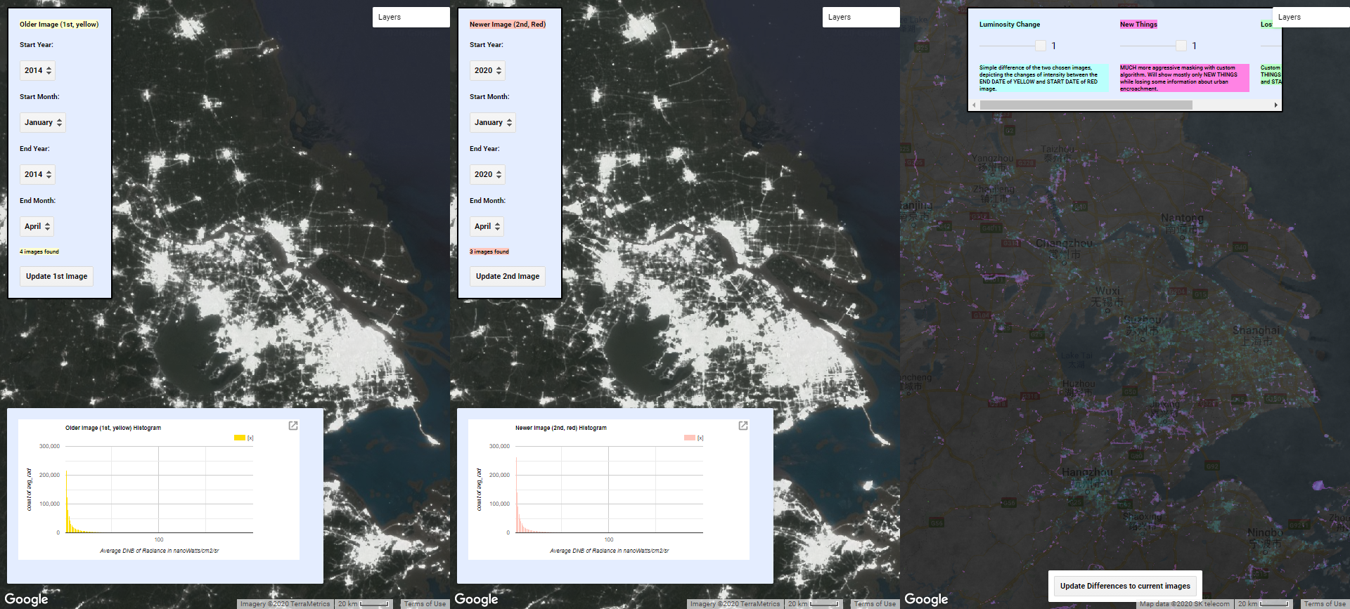
Figure 6. Change in China. In some areas of the world the economic change is quite rapid and can be approximated with the usage of nightlights. Here’s an illustration of it in China, in an area near Shanghai, where a lot of new areas and roads are visible. Click the image to enlarge.
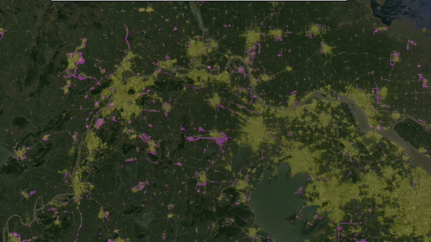
Figure 7. This is sub-part of the same area as in Figure 6 illustrated differently. Yellow are the nightlights from 2014, while on top is the overlay of our spatial difference detector, highlighting changes between 2014 and 2020. Click the image to enlarge.
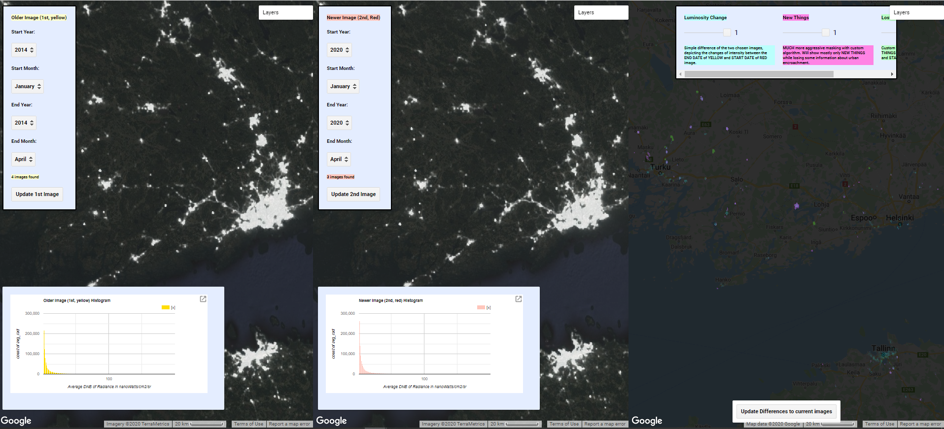
Figure 8. Change in Finland, from the same period (2014-2020) and with the same scale as in figure 6. Based on these images, it should be easy to estimate which area is at least changing and perhaps even developing faster. Click the image to enlarge.
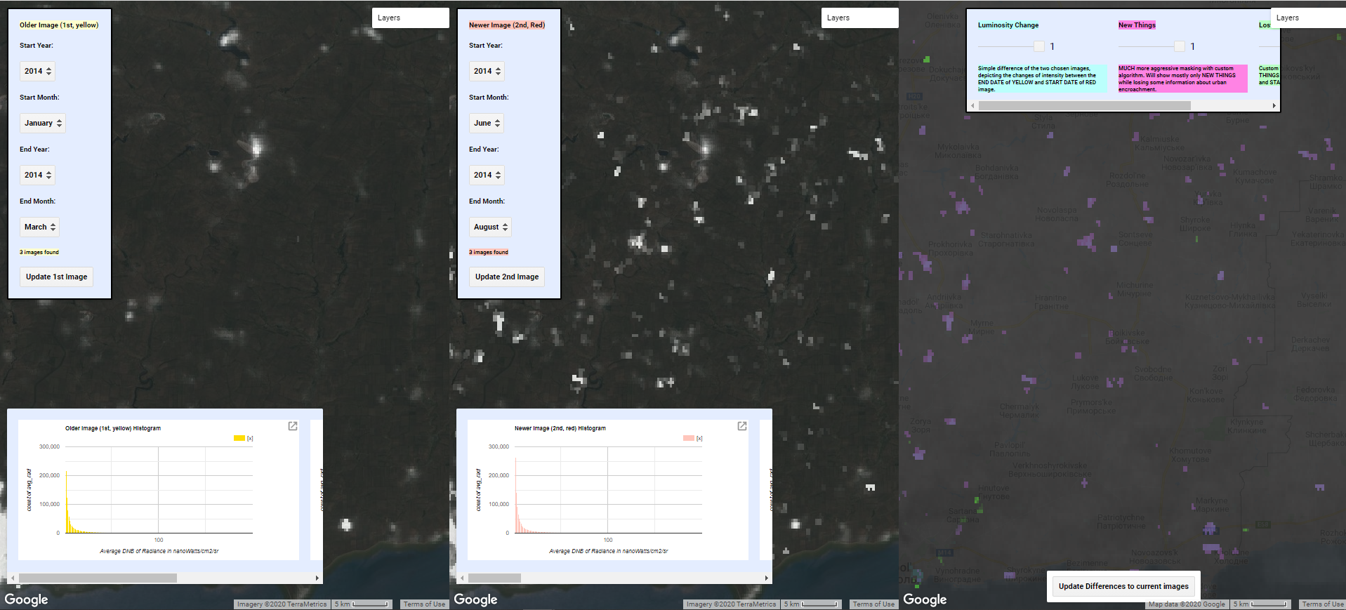
Figure 9. Nightlights can be used to detect other things as well. Here’s a difference in the Donbass region between before the start of hostilities in the Ukranian Crisis and during the invasion. Lots of new lighted areas visible with purple. Most of these seem to be located in the middle of fields, suggesting that they could be different kinds of bases or storage areas, especially those that are located near the border and near highways. Click the image to enlarge.

Figure 10. A more detailed example of the new light sources during the Ukranian crisis, near Mariupol. Click the image to enlarge.
We created a simple tool with which we detected these abnormalities. Tool is found here. Tool is a custom script running on Google Earth Engine. Google Earth Engine is a platform created and operated by Google and is free to use. Key feature of the Google Earth Engine is the extremely large dataset of varied spatial information and satellite images that it stores and allows manipulation and visualization of with custom scripts.
The key features of our tool are to make it more comfortable to explore nightlights, nightlight differences and the automatic highlighting of interesting areas. The data it uses has been observed by the discussed VIIRS instrument in the spectral range of 500nm to 900nm and has been composited to monthly averages. This means that for each month between 01-01-2014 to 01-03-2020 an monthly average of radiance for each observational unit has been calculated. Averages are straightforward way to compensate for temporary changes and obstacles, such as clouds, between the observed area and the satellite. It should be noted, that depending on the time of the year and the latitude of the observed area, there might be some months where there does not exist good data for the area. Reason for that is quite fundamental. For example in Finland, which is part of the northern hemisphere and in quite high latitude, the sun is visible at least partly for most of the nighttime during summer. Therefore, the emitted radiance from surface tends to be lost amongst the reflected radiance originated from the sun. Simply, there is not dark enough for good observations. Our tool contains a rudimentary visual metric for the quality of the observations though. Our tool looks like the figure 11 and is already perhaps familiar to you.
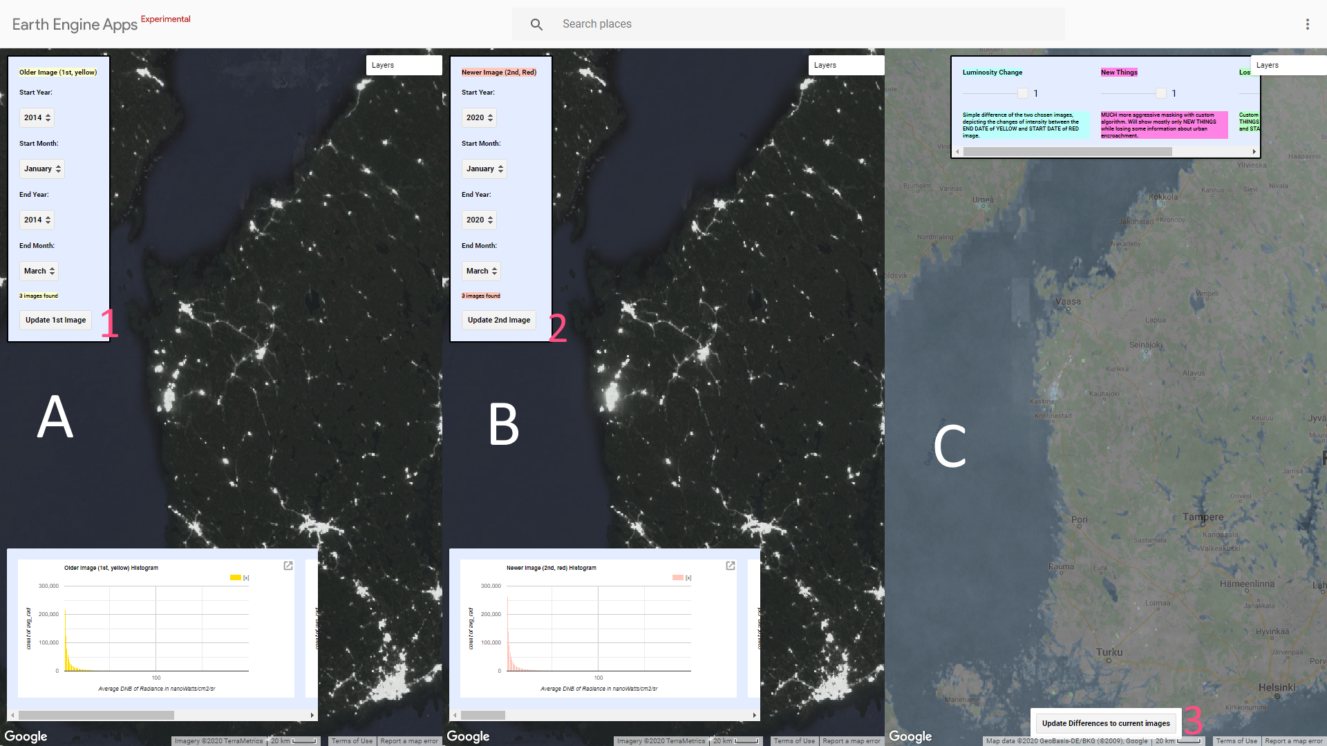
Figure 11. Annotated screenshot of the tool. Click the image to enlarge.
Overview of the tool
Area “A” contains the first image chosen visualized and the accompanying histogram displayed. Area “B” is similar and contains the second image. “A” image is intended to be the earlier image and the “B” image the more recent one. Area “C” contains some of the tools we created for highlighting the differences between the images “A” and “B”, quite similar to the image that we published in Mega magazine. In areas “A” and “B” you have two settings for the dates in both. The tool will calculate average of the monthly averaged observations between these dates and visualize it. First, pick the starting year and month, then the ending year and month for the observation period. Click button 1 or 2 respectively. The tool will then update the text in the panel and tell how many monthly average images it found, which it will then average. Histogram of the spread of the values will also be updated based on the current data and the area that is currently visible on the map area. If you move the map, you can refresh the histogram for the current area with the buttons 1 or 2, while keeping the other settings the same. Please note that values of zero have been left out of the histogram.
In area “C” you have three sliders and three choices for inspecting the differences between chosen the images. We have named the choices “Luminosity Change”, “New Things” and “Lost things”. “Luminosity change” visualizes the difference between the images. Simply put, from the pixel values of the second image, the more recent one, is subtracted the pixel values of the first image, the older one. It’s marked on the map with cyan. “New Things” uses our custom developed algorithm in it’s early phase, which attempts to filter out just changes in already existing luminosity and tries to highlight interesting spatial change. Simply, it tries to find out new things that have appeared in the map between the dates of the two images. It’s marked on the map with purple. “Lost Things” utilizes the same filtering phase as “New Things” but attempts to highlight negative spatial change, ie. things that have disappeared between the image dates. Background layer in area “C” is the sum of the observations per “pixel”. If it’s very dark, then you know that the measurements can be misleading. If it is white, grey or hazy there should be tens of observations for that area in the time period. With the button number 3 you can update the differences in the area “C” to match the images “A” and “B” if you have picked new dates for those. With the sliders you can easily control the visibility of these different things. 0 means it is not visible while 1 means it’s very clearly visible.
Tool usage
Usage of the tool is straightforward. As it opens up, for “A” is loaded data from the winter/spring of 2014 and for the area “B” data from winter/spring 2020. Area “C” highlights differences between these dates. If you wish to observe different time periods, first choose dates for area “A”. Please note that you have to make certain that the first year and month is before the second date, the tool does not check that. Once those are picked, press button 1. Do the same for area B. Last step is to click button 3 to update the differences to match these images. Feel free to scroll around the world and test out different zoom levels. Please be patient as sometimes it takes a while for the new layers to be loaded. You can see the loading indicators at the top right corner of each area.
We’d be quite interested in your experiences using this tool. What kind of interesting things you can find with it? Near your home place or anywhere on the globe. Can you explain the change you see? We’d love to hear about it and will publish the most interesting ones on our webpage! Also, as the tool is freshly created there might be some odd things now and then happening. We’d also really like to hear about these as well, so please let us know. You can reach us via email