Springtime Vegetation Blooms
This month, central to our featured image was something called NDVI index and the image was based on the observations of Sentinel-2A satellite. To explain the NDVI, let us go back to the fundamentals that we have discussed earlier. Sentinel-2 satellites save the amount of electromagnetic radiation on several different wavebands, with their MSI-instrument as illustrated on image 1. Normally, to get the same picture as we would get if there would be a regular camera mounted on the satellite, we would use the electromagnetic radiation saved in bands 4, 3 and 2 for the amount of red, green and blue colors in the picture (so called RGB-image). As you remember from the false color conversations, we can use other bands to represent the amount of color for red, green and blue, every time seeing something that we cannot observe from a “normal” picture.
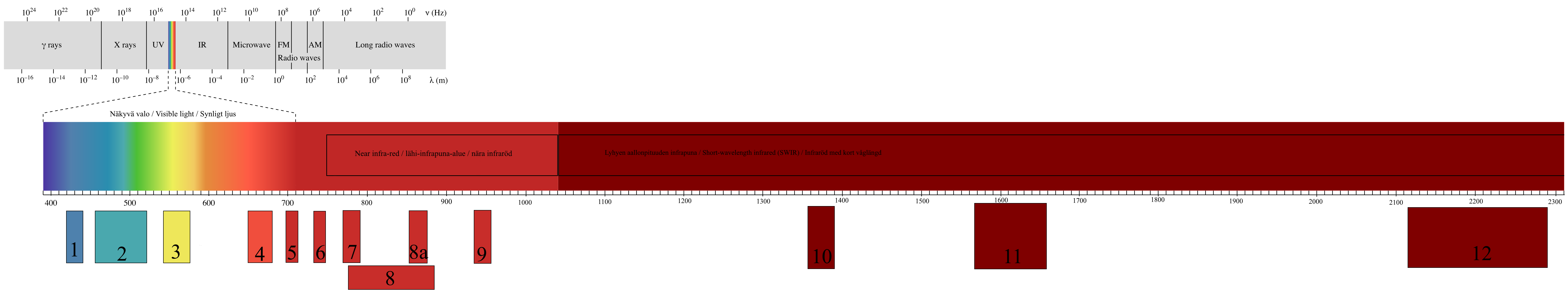
Image 1. Click to Enlarge
With index in remote sensing, we mean something that is calculated with the values in different bands. The calculation itself can take many forms. There are a lot of different ways to examine the relationships between the numbers Sentinel-2 satellite has saved for different bands in the same area. Images in your screen consists of pixels, little squares or rectangles that are so small usually that you cannot see them. The same is true for the Sentinel-2 images, you can imagine the picture consisting of a grid put over the area the satellite is seeing. For example, in the image 2 you can see this kind of grid put over the sports field in Vöyri. Additionally, in the same image is visualized the idea of how the Sentinel-2 saves electromagnetic radiation information for each pixel for each bands. This is simplified visualization, as in reality the “pixel size” is different for some of the bands, but we will talk more about that in upcoming conversations. Also the numbers are in reality in a bit different form.
Image 2.
One of the simplest indices to illustrate the concept could be snow detection. With Sentinel-2 data you could take the value of band 3 and divide it with the value of band 11:
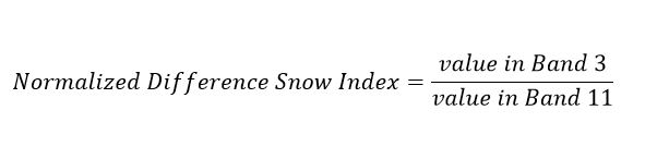
If the ratio is higher than 0.42, the covered area is usually snow. Why does this work? Because the difference of reflectance in different wavelengths for different kind of things, as we have discussed in the earlier conversations. Here, we look at bands 3 and 11, meaning the wavelengths are centralized at around 560 nm and around 1610 nm, and investigate especially the reflectance in the band 3. Snow reflects back a lot more in that wavelength area than bare soil, while at band 11 the reflectance is relatively the same for snow covered ground and for areas not covered in snow. We can then test for it with the simple division above. So, with the example figures band 3 would be 30, and band 11 would be 30 in that pixel. 30/30 is 1, so we could then suspect the area the pixel covers would be snow. We could also save that information for further use and do that for all the pixels. The result would be something like here in the image 3, our example pixel highlighted in green.

Image 3.
Now we have a new 6x6 “table” which is also called a matrix. All 2D images can be thought as matrices. For each cell, we have the result value of the snow test, and each cell is related to the pixel in the original image. Now we can color this image based on these new values. As in image 4. We have colored the image so that the pixels with higher ratios are colored with lighter tones, looking more like snow. Lower ratios, where there is lower chance of snow based on the ratio, are darker.
Image 4.
And then finally we remove the numbers for clarity, as in the image 5 below. What we have here after this kind of process, is something we could say is a snow probability image. For this new saved information, a very crude and simplified snow index, we could have chosen the color values however we wish. We chose something related nicely to theme, white as snow for higher likelihood of snow and darker for the absence of snow.

Image 5.
In the featured image published in the Mega magazine this week, shown here below in the image 6, we have two images from different moments of time of the same area (Vöyri) and the NDVI calculated for both of them. We have conducted a process similar to one we described above. Instead of a snow related index, we used an index determining the amount of green vegetation in each pixel, saved that index information for all pixels and then used green shades for coloring the different values. The result of this process is shown as the leftmost and the center images of the image 6.
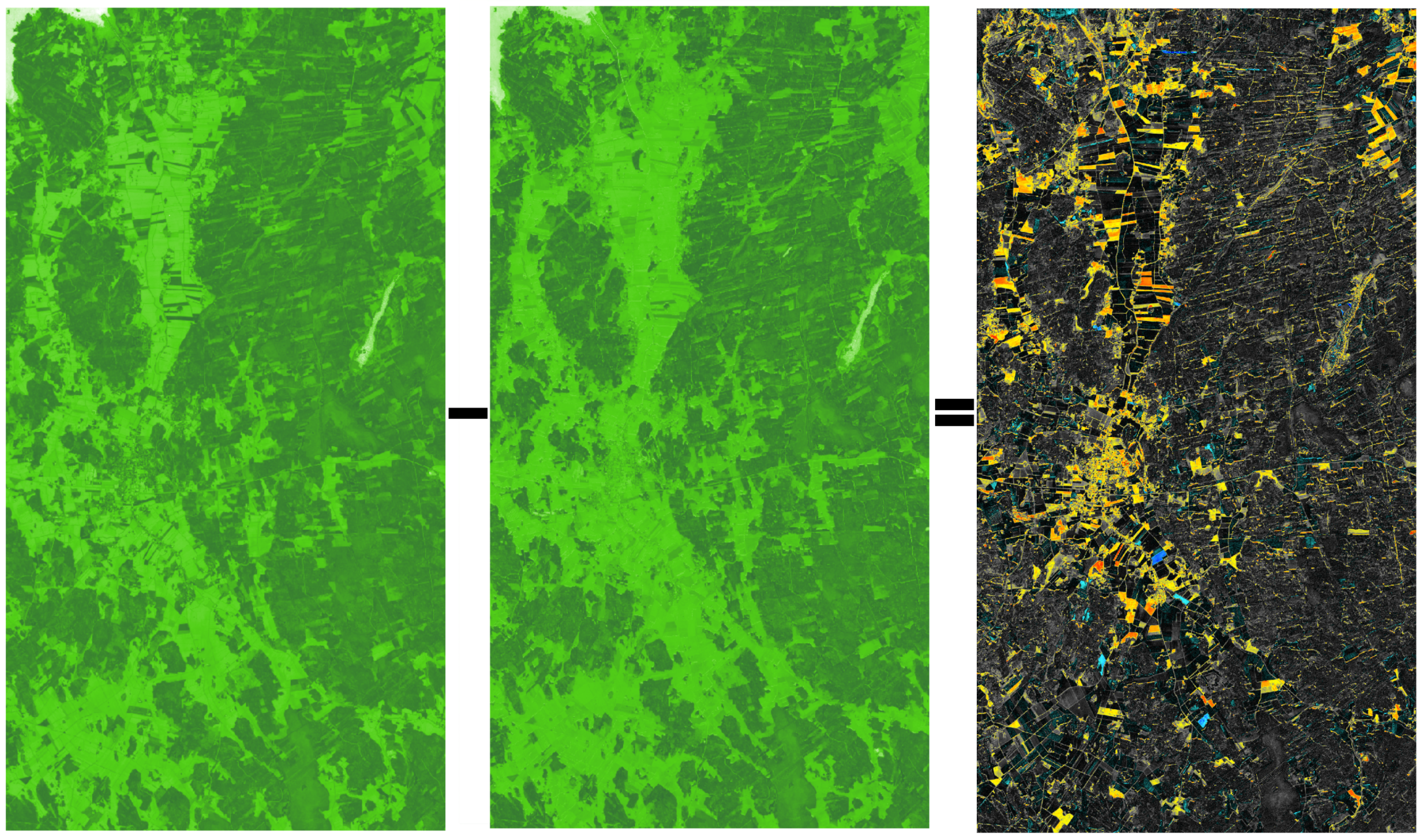
Image 6. Click to Enlarge
NDVI index that we used is called Normalized Difference Vegetation Index. Just like the snow example, it is based on the difference of reflection and absorption on two wavelength areas. Green leaves contain chlorophyll which absorbs strongly red light. On the other hand, the structure of the green leaves reflect strongly near-infrared light. Based on this difference, we can calculate an index, which shows high values on the areas where there is a lot of living green vegetation. Equation is as follows:
In our example we used bands 4 (red) and band 8 (near infrared). As a result, we got a big table (matrix) that contained values from -1.0 to 1.0, one value for each of the pixels in the image. Negative values are mostly water areas (you can see them in white in our image) and values close to 0 have no green vegetation. As the values go higher, the amount of prosperous green vegetation gets higher as well. We then chose to color these values with a scale where the darker greens represent the areas with higher NDVI values. As you can see, it corresponds quite nicely to the forests and the fields with growing crops. Even in the center of Vöyri you can see significant difference between the two images as grass in the yards has grown during the time difference of one month and one week between the images. NDVI is useful for these kinds of forestry and agricultural mapping purposes.
But what about the last image on the right, the one with black, red, yellow and blue? That’s a difference image. In the Image 7 below, you can see the idea and the process simplified. The left and the center images correspond to the real images where we calculated the NDVI. In these, for each pixel there is an NDVI value. For higher values, we used darker greens as these areas have more green vegetation. Now, we subtract the NDVI value of each pixel in the earlier image, from the NDVI value of that same pixel in the later image. That will give us the difference of NDVI values. The result of that calculation is stored in a new image, for each and every pixel. For example, in top left corner, from 0.9 – 0 = 0.9, and the 0.9 is stored in new image. Or, similarly lower right corner: 0.2-0.9 = -0.7, and the -0.7 is stored.
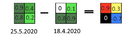
Image 7.
Now we know what the values mean in the difference image. Zero or close to zero means there has been not much change in the NDVI between the dates in the area covered by that pixel. High values mean that in the time between the images, there has been a lot of green vegetation growth. Negative values mean that during the time between the image shots, the amount of green vegetation has decreased. We chose different colors to represent these different types of change. We used red for large increases in green vegetation, yellow for smaller increases, black and grey for areas with no significant change and blue for the areas where the vegetation has decreased. Now if you zoom in to the main image, look in all of the images at the areas that are in red or blue, you should be able to see fields that have grown a lot and which ones have already been harvested for fodder.