Down the Ski Slopes in Northern Finland
Interferometric calculations using Sentinel-1 observations
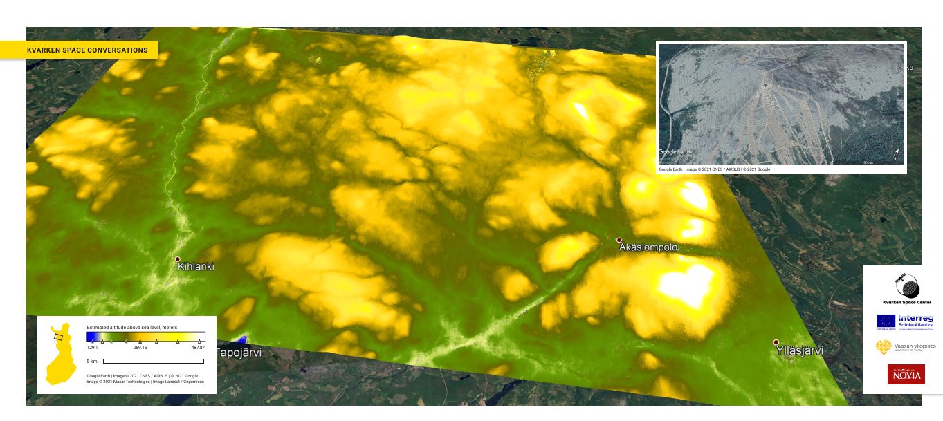
Figure 1. Image presented in Mega-Magazine
There’s a nice image of slopes above, as this week we published and presented an interesting application of space-based data. We demonstrated how it is possible to use observations from the European Space Agency’s Sentinel-1 constellation to generate a model of the highs and lows of the earth surface. And to match the theme of winter holidays, when many travel to the different ski resorts, we decided to show case the creation of 3D model of the hills of one of the popular resorts. We will cover how that is possible, what kind of steps it requires and what other applications there are for a process such as this.
It all starts with the Sentinel-1A and Sentinel-1B satellites in orbit 693km above the sea level of Earth. They are satellites making their observations using radar (see earlier conversation) which is an active form of remote sensing. In active remote sensing, the energy required to see the target is produced by the observer themselves. Principle is quite similar if you’d use a flashlight to see in the dark. Sentinel-1 satellites send energy in C-band frequency to an area on their right side, then measure the energy reflected from the ground and the time it took for it to return. The differences in the strengths of received energy can be visualized with an image, such as in Figure 2 below.
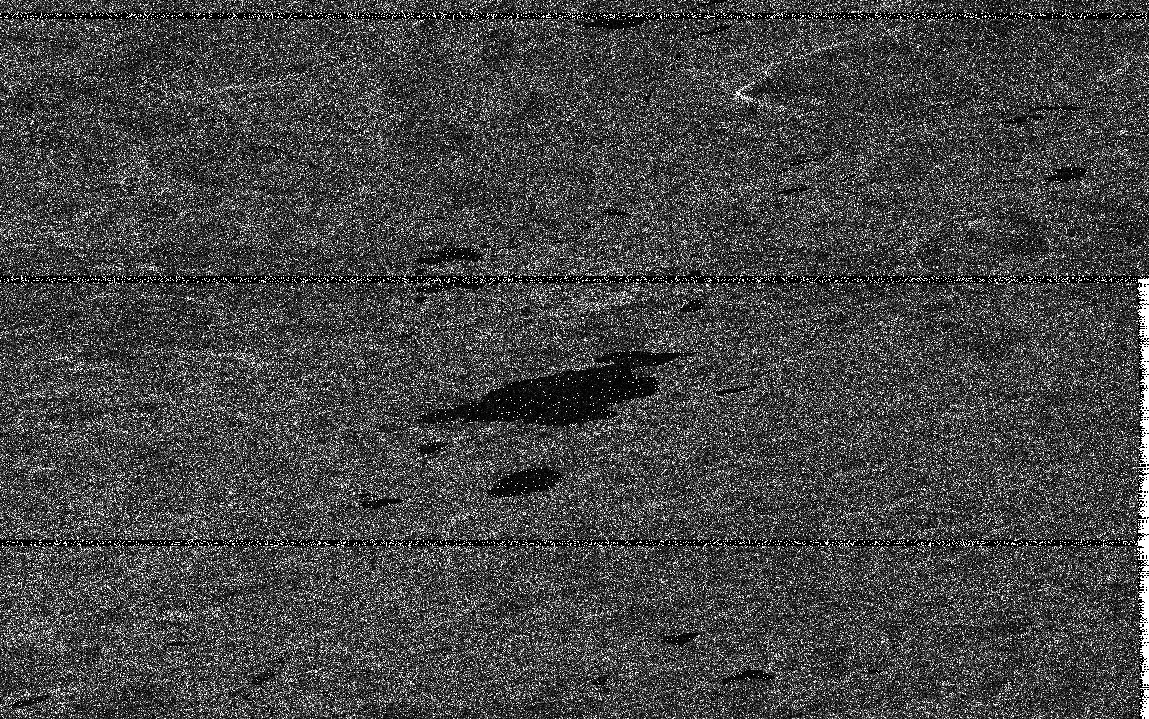
Figure 2. Radar image of Ylläs area.
Having an easily interpreted image such as above is quite a feat already. What you actually see above is the visualization of the amplitude differences in the received reflections, placed on the position of the best estimate of the location. It is an end product of a complex processing chain, starting in the Sentinel-1 satellites travelling at great velocities around world measuring just the distances of the reflections of the electromagnetic bursts they are sending. There are several things affecting how something in the ground actually looks like in an image such as this. First, let’s consider briefly just variables related to the physics of electromagnetism.
Physical factors affecting the SAR observations
Sentinel-1 uses synthetic aperture radar, SAR for short. You can refresh what that is in the earlier discussion. There exists several factors that affect the result we get. It is not possible to separate one and just examine the effect of that. When change occurs in one, then there’s changes in the others. One of the keys is the wavelength. Longer the wavelength, better and further it penetrates in the objects in the ground. Wavelength of Sentinel-1 is approximately 6 cm. Penetration is linked also to the ratio of the wavelength and the size of the scatterer, as is the visibility of the objects.
Polarizations, meaning the direction of the oscillation of the electrical field in an electromagnetic wave, can also affect the results. When waveform interacts with an object in the surface, the polarization of the wave can change. Different polarization combinations in sending and receiving can reveal differences in material and geometrical organization of things and objects in the ground. The angle the radar beam hits the surface in the ground affects how much of the beam is reflected back. Given identical objects, one with small incidence angle and one with larger, the one with smaller incidence angle would appear brighter.
Geometry of the surface observed has also a major effect and the relation of the geometry to the direction of satellite. This was also explained in more detail in the linked earlier discussion. Dielectric constant, or relative permittivity, of the object on the surface affects the return signal. Objects with high relative permittivity reflect more of the burst and vice versa. Moisture also generally adds more reflectivity. Smoothness and roughness of the surface, both of which are defined by the ratio of variations in their size to the wavelength of the radar, have effect on the amount of backscatter. Generally, smooth surfaces return less of the transmitted energy. Antenna of the satellite transmits more power in the center of the area during observations, and the distance to the edges of the observed area have an opposite effect.
As you see, there are many factors involved and we have barely scratched the surface. You should not worry if everything does not seem clear for you, we will look them more detail in the future. The main thing to understand, is that producing radar image from space is complicated, and there are several very interesting details involved. There are more things under the surface even though the result is quite similar to a photograph. But these things are the reason why some interesting further processing can be done and also the reason for the limitations of such processes.
Creation of the digital elevation model
We humans have enjoyed the opportunities given by maps for a long time, from the crude depictions of the world in the earliest surviving ones in the fertile basin of Tigris and Euphrates to the real time digital maps of today. If you are like me, you really like maps. It gives a chance to explore locations you have never visited, as you can understand the layout of the land in three dimensions, even if you only have a two dimensional depiction of it. For us humans, interpreting the symbols on flat paper to visualize the area in three dimensions is not hard. For computers it is harder and more importantly, inefficiently imprecise.
Computers can process through a lot more detailed data and thus support applications with much higher fidelity requirements. Digital elevation map (DEM) is one way to depict this three dimensional information in high precision. It can be visualized as an image, where each pixel contains instead of a color, a value that represents it’s height. These height values can be presented with different color scales, such as below in the figure 3 with a gray palette. At the center, you can see Ylläs area.
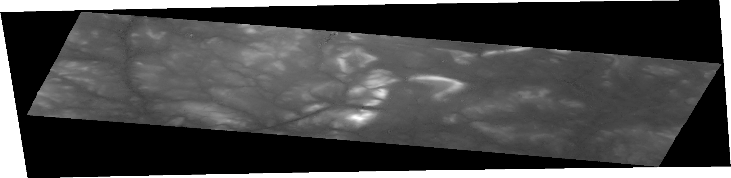
Figure 3. Digital Elevation Model (DEM) of the Ylläs area.
We will briefly go through the steps and necessary theory on how to transform the image in Figure 1 to the end result we have in Figure 3. First, what we have in Figure 1 is level-1 radar product. Which means that it has already gone through quite extensive processing pipe in ESA’s datacenters before it has been available for download. Most of these steps were different internal calibration, correction and usable product generation related steps. These are based on the detailed knowledge of the platforms, their characteristics and the location during the data ingestion ESA has available. However several correction steps still remain to make it fully usable.
Figure 1 depicts Sentinel-1 Single Look Complex (SLC) product. It is enough for our purposes to know that it includes the phase information and that some of the correction steps still remain to be taken. Phase information is important, as that is the basis for what we will be doing. The process what we’ll do is called interferometry. If we have two separate SAR observations with the phase information stored of the same location, we can use the phase information to determine the elevation. There needs to be a proper difference in perspective with these two observations and, very importantly, observations need to match each other well enough.
Matching each other well enough means that in general sense, there is not much change in any of the physical properties that we discussed earlier between the two observations. For example, if other was observed just after or during rain and another in dry season, as we learned from the physical variables, the moisture could affect the result in away that the two observations cannot be combined precisely enough to utilize the angle difference. There exists good software tools for discovering datasets with proper potential pairing and a bit further on we illustrate good and bad pairing.
Lets go back to phase as that is critical concept here. In the Figure 4 we have depicted a waveform. Phase can be described as the exact point of progress of the wave at certain time. As we have discussed, radar sends a wave of energy towards the target and measures the reflection coming back. During that “trip” back and forth there’s (in the case of Sentinel-1 SAR) around 23 million (693km / 6 cm) completed full waves. Depending on the exact points of transmission and reflection, most of the waves coming back have 23 million something “complete” waves and then a part left over. Phase describes the amount that is left over. For example, a beam reflected from a certain point on surface would be in the “phase at time t” depicted in the Figure 4, and one quite close to it would be in the “phase at time t +n”. That phase difference with the help of auxiliary information would tell us the difference of distance from the radar to these two points.
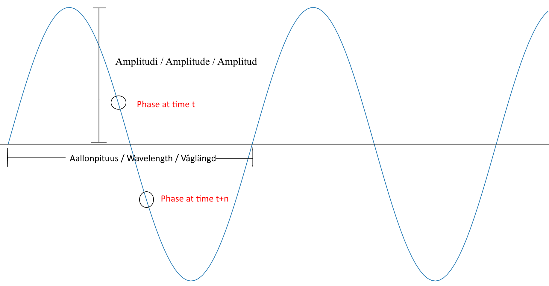
Figure 4. Phase.
Now, we have two Sentinel-1 SLC products chosen with very suitable differences in both the angle they observed our area and the times they did it. For those interested, best combination of products we discovered were Sentinel-1A pass at 20180607T045617 and Sentinel-1B pass at 20180613T045524. Those codes can be searched for in the Copernicus hub and contain the date and after the letter T hours:minutes:seconds in 24h format for the beginning of the ingestion. If you want to follow along, you can look up the precise steps from the links we provided, we skip here the exact details for readability.
One SLC is a very large amount of data covering large area, approximately 250 km wide. First step is to remove the unnecessary data concentrating on those that depict the area we are interested in. In Figure 5 you see the area total area coverage of single SLC and smaller white boxes represent the area we are interested in. Larger white box shows the area covered by the pairing product.
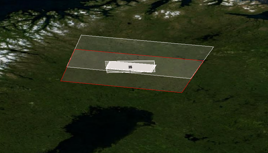
Figure 5. Area of interest and extranous data.
After splitting from the original image the parts we are interested in, we do first step of the corrections. As the product does not have corrections based on the exact orbit, that is done next. After that quite interesting part is done in which the images are co-aligned. It’s called co-registration and in that the images are corrected to geography they represent and to each other. In other words, images are put on top of each other in a way that feature in lower image is in the same spot in the image overlaying it. This is actually quite fascinating process with a lot of different algorithms and strategies and we might revisit this exact issue in some future conversation. After one more enhancing step of the result, we arrive to the moment of truth for dataset, forming the interferogram.
In Figure 6 below you can see the phase difference we discussed visualized, over the slopes of Ylläs. Visualization is cyclic. If you recall, waveform repeats in full circle pattern, which in radians is 2*Pi. Hence the actual data values of pixels in the figure contain a number from –Pi to Pi, ~-3.141 to ~3.141. As they are colored, it is easy to identify the cyclic pattern of phase differences. Additionally, even here from the phase image it is easy to see areas where the phase differences do not make sense, for example in the lower left of the image. There for some reason or another, observations are not good enough for good presentation of the phase differences. Coherence image depicts matching of the observations and you can see it in the figure 7. The figure shows dark shades as an indication of poor coherence values. You can see the tops of the hills show great matching.
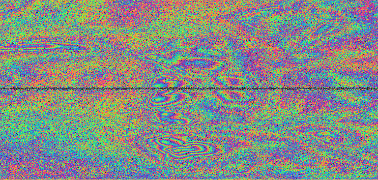
Figure 6. Phase of the interferogram.
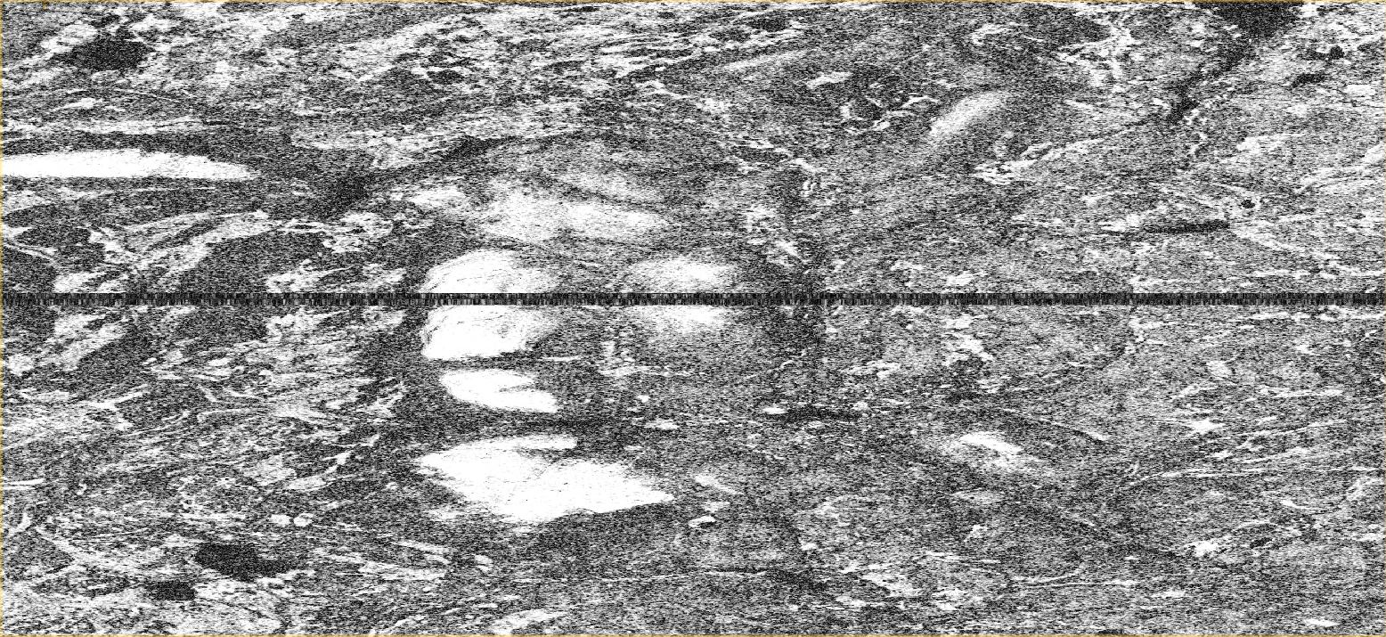
Figure 7. Coherence of the interferogram.
Next we deburst the image which means combining the two independent bursts we have. You can see this in the next figure, Figure 8. It visualizes the amplitude intensity on certain polarization. It is easy to spot the removal of the black division line and if you look carefully, you can also see that for the same geography depicted on both images, just next to the division line, the extraneous information is removed. In the Figure 9 is depicted the result of the next quick step, filtering. As a result, the intensity image is much easier for human to understand and some hints of the three dimensional form can be seen. However, there are still a lot of distortions displayed and not all of the natural conclusions of the terrain can be trusted.
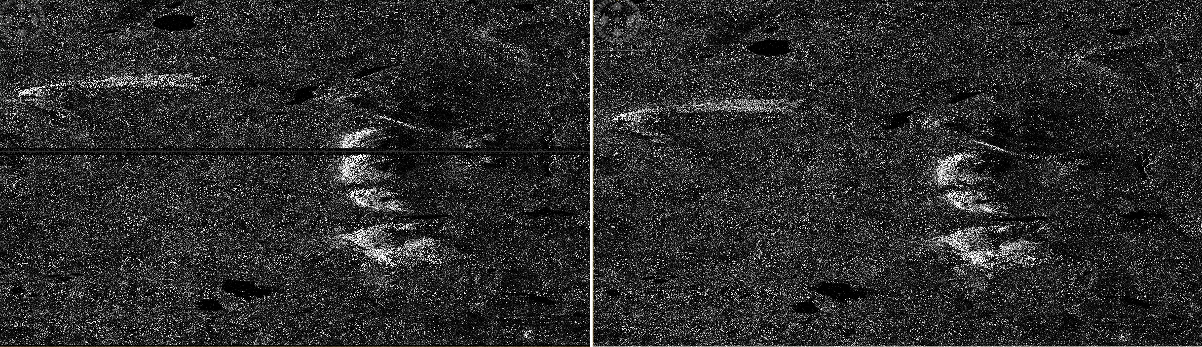
Figure 8. Deburst.

Figure 9. Filtered intensity image.
Now we arrive to the steps where we can start to see the actual results. We unwrap the phase match the phase to elevation. Meaning that as in the figure 6 saw the circular phase, now we try to match the “leftover” phase with the distance information, and put down a number representing the right number of completed waveforms and then add the phase information on top of it. After that is done, then just the radiometric terrain correction has to be applied and we have a DEM of our own. These can be seen in the figures 10, 11 and 12. As you can see, as the terrain corrections are applied, the area is not anymore depicted as a mirror image, as it was due to the observations being on an ascending pass.
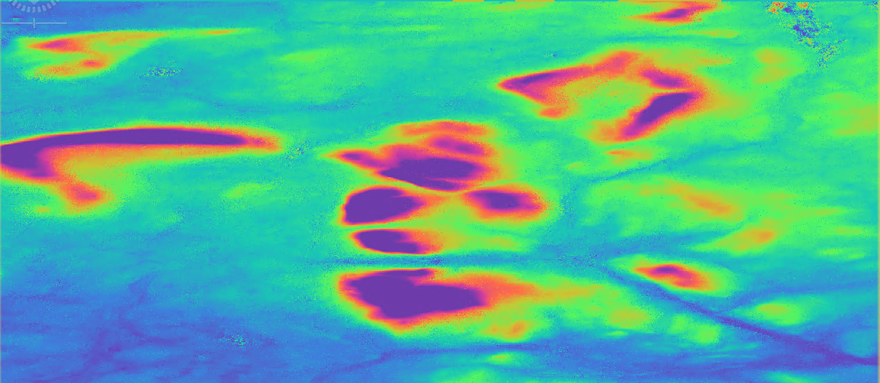
Figure 10. Unwrapped phase.
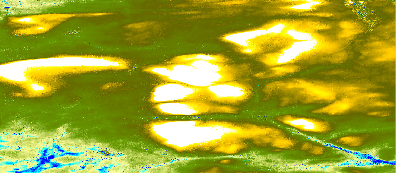
Figure 11. Digital elevation.
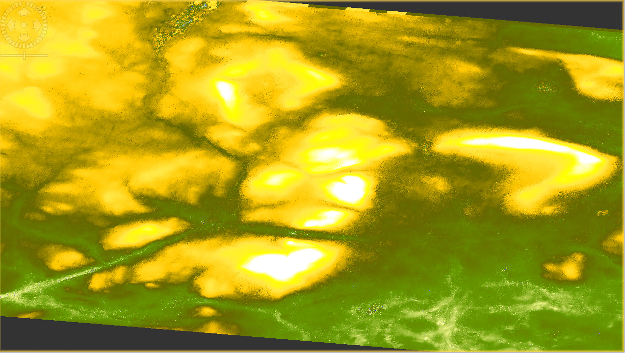
Figure 12. DEM terrain corrected.