A Data Science Method Using Multi-spectral Remote Sensing Data
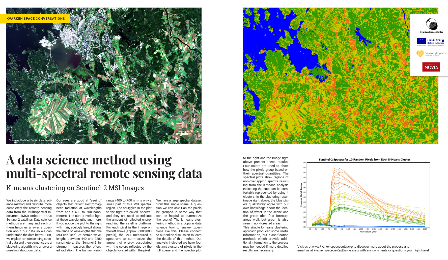
Figure 1. Published article.
This time we go back to the optical measurements. We published the results shown in Figure 1 in the latest Mega-magazine. As you remember, the Sentinel-2 Multi-Spectral Instrument (MSI) rides above us in two similarly manufactured satellites, Sentinel-2A and Sentinel-2B. The MSI instrument is, in many ways, similar to a normal camera – it measures electromagnetic (EM) radiation originating from the Sun, which travels through space, then reaches the surface of our planet, reflects off objects and returns to the MSI device on the satellite platform. The difference is that a normal camera records only the wavelengths of this electromagnetic radiation our eyes can sense. Those wavelengths are in the range of 400 nm to 700 nm. The MSI device can measure a wider range of this radiation, starting at wavelengths near 440 nm in the blue region of visible light and ending in the short-wavelength infrared wavelengths near 2200 nm. (as you might recall from our earlier conversation [LINK]).
What do optical devices such as MSI then exactly measure? It measures electromagnetic radiation originated in the Sun as a result of nuclear fusion. Sun is massive, size far beyond our common sense to fully comprehend. If you think how big the Earth is, with all the countries, continents and oceans, it’s also vast. Still, if we’d represent Earth’s mass with 1L milk carton (~1kg), Sun’s mass would be roughly equal to weight of an Boeing 747 airplane. Sun’s immense size and extreme mass create conditions for the nuclear reactions to happen in the core. These reactions are the reason we exists. All the energy that life in Earth requires, has and is originated from these nuclear reactions in the end. Just as a side note, similar reactions in other stars long ago have created the more complex elements that are also part of our bodies.
Before EM radiation reaches space, it has to go through different layers of matter in the sun. These layers consist of different molecules and gases, held together by the gravitational field of the sun. Some of this matter can react with different wavelengths of this EM radiation and absorb some of the energy. After the “atmospheric” layers of Sun, EM radiation reaches space. As the EM radiation is travelling to all directions from Sun, the further we are from the source, the smaller amount of the energy reaches us. It’s a bit similar to shooting a shotgun, the pellets are very close together in the beginning, but further you go, more apart they are.
Once that diminished amount of EM radiation arrives to Earth, first it goes through the Earth’s atmosphere, where on some wavelengths it is absorbed completely, on some wavelengths partially and on the wavelengths we are interested in just slightly (that is not an accident!). After that, it interacts with an object on the surface, reflection passing through the atmosphere second time with additional slight disruptions, and then finally being measured in the satellite to the best extent of the instrument. This is called “top of the atmosphere” measurement and that is the real physical measurement we have. We get this result after the EM wave has had the potential to interact in three places on our planet: arriving through the atmosphere, interactions in the surface and the way back to the satellite again through the atmosphere.
In the images we have presented from Sentinel-2 we have used “bottom of the atmosphere” measurements. In reality, there is no physical measurement from the bottom of the atmosphere. There is no camera below the atmosphere but still we get the results as there was. The top of the atmosphere measurements are processed and corrected by complex algorithms based on the information ESA has about the atmospheric circumstances during the time image was taken, and the result is then provided as a bottom of atmosphere image.
The key to remember is that with the bottom of the atmosphere images, we don’t have to worry about the distortions during the waves entry to the atmosphere nor the distortions when it was exiting the atmosphere. The only point of interaction (that happened in Earth) remaining visible in the measurement is the interaction happening when the EM wave meets something in the surface. Therefore, we can use these bottom of the atmosphere measurements to infer something of the nature of object it met in the surface.
Spectral Profiles
Here in the Figure 2 we have an example of such measurements. Chart displays measurements in all of the 13 bands in Sentinel-2 satellites in two locations, a field looking brown and a field looking green, with Sentinel-2 MSI Bands identified with red text. Each cross mark represents value measured in that band in that pixel area. Even with a quick glance, we can already see that they are different. Finding these kind of differences and interpreting them is central in remote sensing.

Figure 2. Spectral profile for two pixels as measured by the MSI instrument.
Before we start to interpret these, let’s take a look at the y-axis. Measurements we have in Sentinel-2 products are “digital numbers”. They are not directly related to any SI unit. They are calibrated and they can be compared directly to the results in other Sentinel-2 products through the years. Algorithms and trained neural networks exists that can approximate these numbers to a situational physical meaning. But as they are here, they do not have other direct meaning than a relative measurement in that band, directly comparable only to other bands and to other Sentinel-2 products. But that is enough for us. We can concentrate on the relative differences in the measurements and see what they tell us about the differences of things on the surface covered by these two pixels.
What can we estimate from this image? Very roughly, we see that just in the visual bands there are some interesting things: B2 in the visual blue area there is no difference; B3 in the visual green area, the green field reflects roughly double the amount of brown field; and in the B4, the in visual red area, the green field pixel seems to have roughly 2/3rds of the reflection of the brown field. These observations are logical – plants have chlorophyll, which can extract energy from sunlight for the photosynthesis process. Chlorophyll absorbs EM energy in the red wavelengths best and almost none in the green area of light. Most of the green light is reflected, that is why we “see” green plants.
Relatedly, as we cross over the human visible area of 700 nm, to bands B5 and further, we see a sharp increase in received reflection from the green field. We could count that as a chlorophyll related measurement as well and as an indicator of it’s presence – it consumes most of the energy in the visible light areas and almost none in the near-infrared range, hence the rapid increase of reflection in the green field and much smaller in the brown field. All of this seems to tell us that in the green field there are more green vegetation than in the brown field. A conclusion that is easily acceptable for us.
If we add other locations, we see different profiles for different kinds of locations. Below, in the Figure 3 we see similar spectral profile plot for five different pixels. It is easy to see that all profiles are distinct. Explaining each of the differences in relation to others is not as easy. We could spot some similarities, such as the fact the profile of green field and the dark forest is roughly of the same shape, but with different values (both green in the Figure 3). We could call that “Green class” to simplify further investigation and to support our initial conclusions of characteristics of the area. However, grouping similar profiles in classes by visual inspection of the full spectral profiles for 7,2 million pixels in the original image is not possible for a human. Luckily there are better and far faster methods to do that.
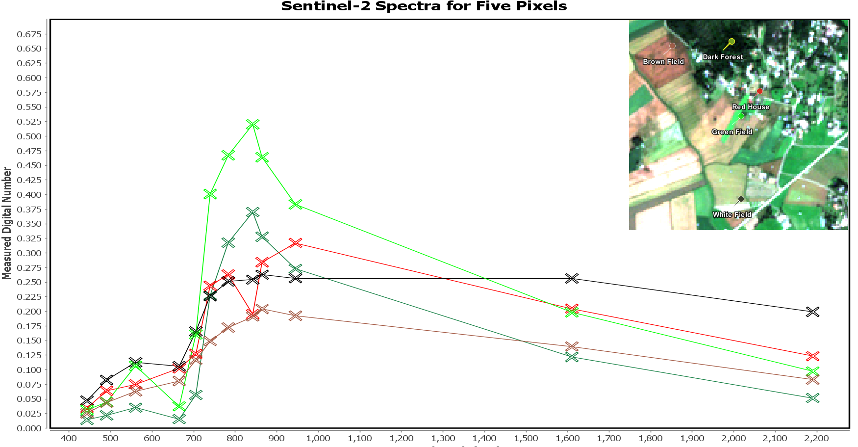
Figure 3. Spectral profile for 5 pixels as measured by MSI instrument.
k-Means
If we would have data on just the three visible bands, it would be hard to beat human brain for creating some rough approximation of clusters within the data. We could just show it as an image, and quite fast we could estimate roughly what we have there, or draw similar conclusions from displaying it as a 3D plot. As soon as the data has more than three dimensions, as is the case here, it is hard to visualize it - without touching it - in a way that would allow us to utilize this capability of ours for the whole dataset.
One tool for that initial investigation of data is k-Means. In real life data, in various fields, often is the case that the same class of things have slightly varied exact forms. Matching these roughly similar cases in a same class and examining the simplified data based on the classes can be helpful for the initial conclusions. k-Means is a simple, iterative and unsupervised method for gaining those insights. Simple, in the sense that the logic of it is quite straightforward to follow; iterative, as we start with some initial guesses and refine them pass after pass; and finally unsupervised, as to perform the classification we don’t need to know the right class or examples of the right classes.
We start the k-Means clustering with two guesses – the first, the number of the classes we think that comfortably describes the data, and the second, the initial guess of the means of these classes. The mean guess can be just a random number or a more educated guess based on the data. We compare the initial data points to each of the initial class means, and put the datapoint into the class the datapoint is closest to. After this first iteration, we just update the class means based on the means of the datapoints in the class currently, and perform another iteration. We stop when the results are good enough or we have done as many iterations as we wanted.
Results
Despite the simplicity, we can get surprisingly good results. We used four classes for the Sentinel-2 scene. As shown in the Figure 4, random examples of class pixels are quite nicely apart in the formed classes. Most of the differences the separation seems to have occurred on, are on the 700 nm to 1000 nm wavelength area. That means most of the information the classification was based on is outside of the visual light wavelengths. That area is called the red edge and near infrared area. Differences in the chlorophyll content show up there well. Another detail to note is the blue class. That is water. We see that same area of spectrum is the best for discerning between water and land as well.

Figure 4. Spectra for 10 random pixels for each of the four classes.
We can more clearly see the differences between the classes, when we take a look at the mean value of the pixels in a class at each measured wavelength area. In the figure 5, you see the result of going through all of the 7,2 million pixels, dividing them to the four classes and then calculating the average value of pixels in each class for each of the band measurements. It is a bit easier to compare the classes and we get more representative values for the whole classes. Clearly, the difference of the classes is greatest on the visible green area (560 nm) and then in the red edge and near infrared areas, as we cross over the 700 nm. How do the classes look like on the visible area of light, as most of the discerning features are on the non-visible area? Let’s take a look. In the following images you see the same classes presented over a real-color image of the area.
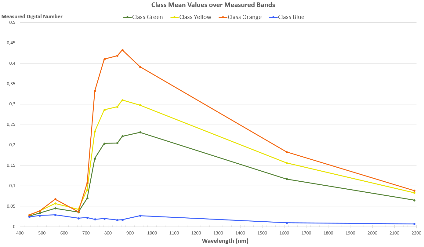
Figure 5. Class Mean Values over the Measured Bands.
Class “Blue” has minimal general level of measurements across the bands. In the Figure 5, we see that this class gets very distinct from all the other classes especially on the wavelengths over 700 nm. That pattern of minimal reflection suggests water, which is confirmed in the Figure 6 below. Interestingly, some of the larger Vaasa area roofs are in the same class as well. These roofs seem to have low reflection closer to the Blue class than to Green class across the bands. Additionally, they are also missing the near-infrared upward curve, which might explain their eventual positioning in this class.
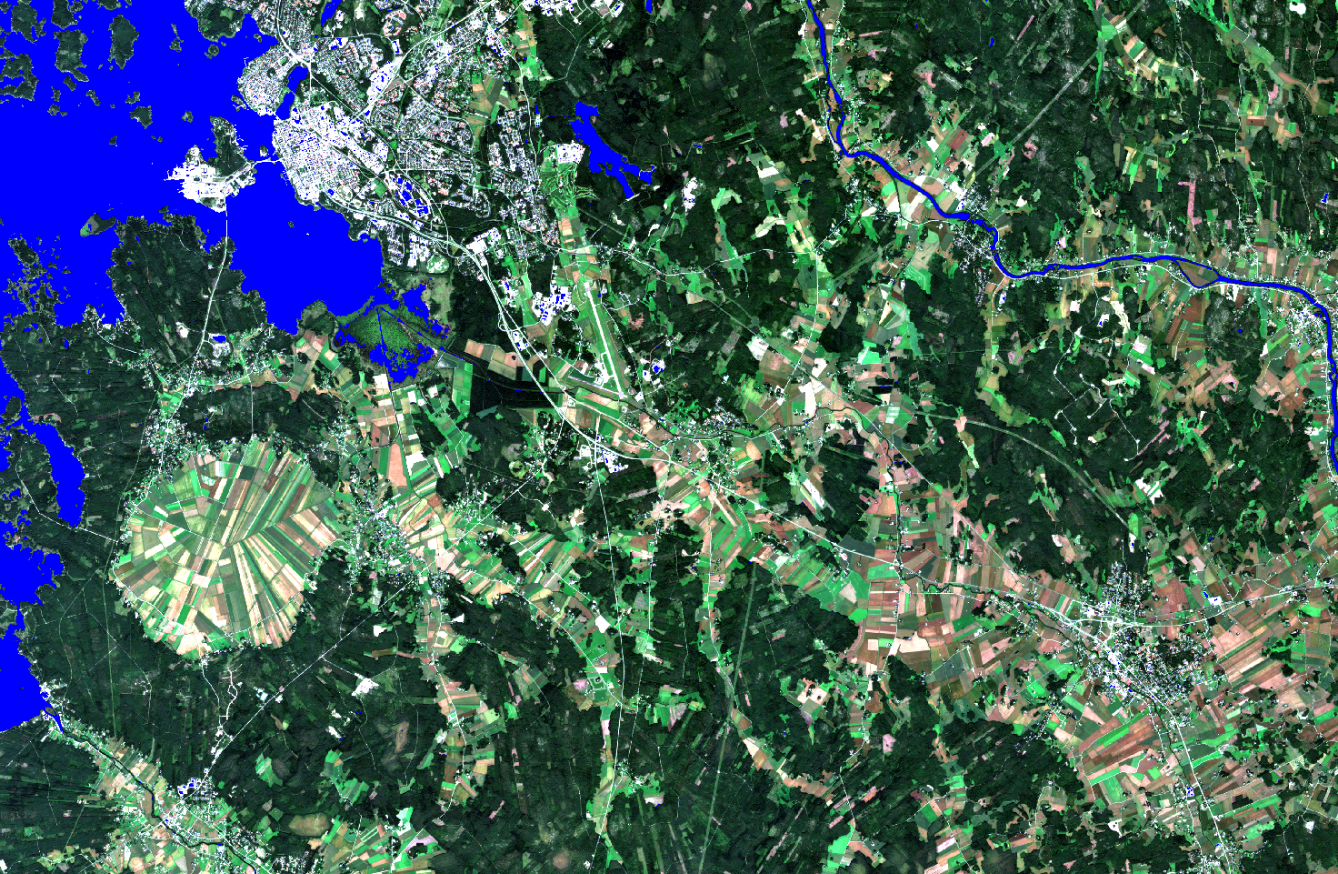
Figure 6. Class Blue.
According to the spectrum view in the Figure 5, class “Green” seems to consist of the things that return the second lowest amount of reflection, both on the visible blue (490 nm), on the visible green (560 nm), on the red edge (705 nm – 783 nm) and the following near infrared areas. Looked at visually, with the figure 7 below, these things seem to be mostly in the forests, so it would include the various trees. Additionally, we see it includes urban area in the Vaasa center and most of the harvested fields that appear brown, for example near the Laihia region.

Figure 6. Class Green.
Class “Yellow” consists of things that on the red edge and on the near-infrared areas return roughly medium amount of EM radiation. In the visible blue and in the visible red areas it’s not possible to distinguish the class, but in the visible green area there is the same trend as in the longer wavelengths. In the Figure 8, we see the largest parts of the class are the fields. Seems like the brown fields and the fields with most green are not in the class, that in fact it would be returning the “average” fields. In the forested area it picks up areas recently cut and undergrowth areas under the electrical lines. Places that have more dense vegetation (more chlorophyll) and less big trees than in the previous Class “Green”.

Figure 7. Class Yellow.
Class “Orange” has the highest general level of measurements. Here we have the fields with most green, private gardens, public parks and cut areas in the forests with rich undergrowth. They seem to be the areas with the highest concentration of chlorophyll as visualized in the Figure 9 below. We see the mean of the reflected values distinctly high in this class in the visible green area and very high in the near-infrared area of the higher wavelengths.
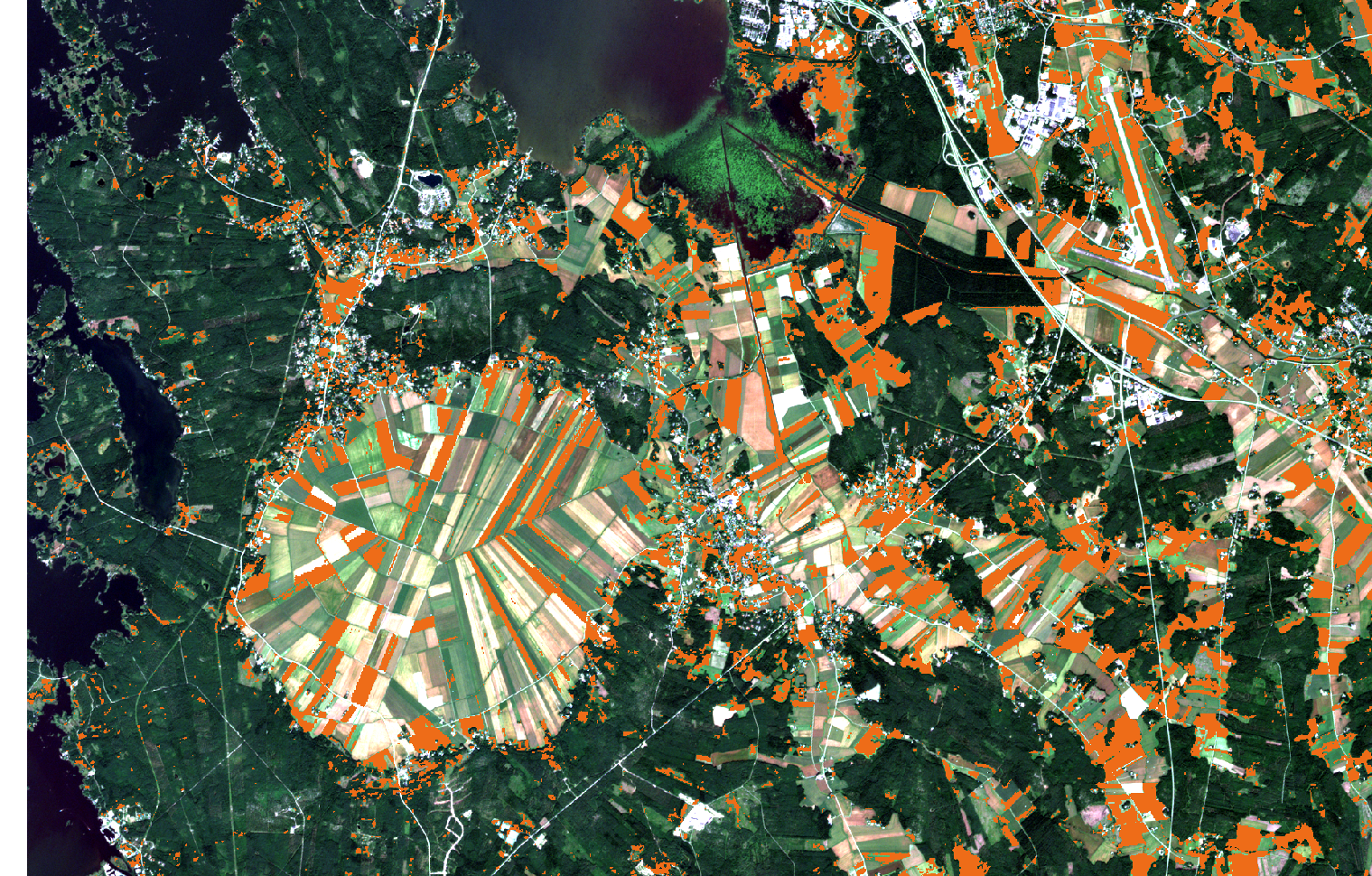
Figure 8. Class Orange.
Conclusion
What is the conclusion we can make here? Even if the material and the geometry of the objects on the surface affect the reflection returns, on larger scale in this area, at the end of the summer the absence or presence of chlorophyll is the most distinct divider for most of the pixels in the image to four distinct groups. That division is easy enough to prove even with the most simplest of clusterization algorithms like we just did.
There are more possibilities in using more refined methods and getting more detailed results. However, the principle stays the same as in the simple example here – examination of spectral profiles also on other wavelengths than just the visible light and grouping them based on the similarities and the differences of the measured spectral profiles.